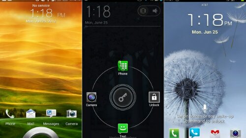
 There are over 700,000 apps in the Google PlayStore but only a privileged few get to levels of insane popularity. These apps have tens of millions of daily users and are an ever-present part of our daily lives, Yet, some of these super-popular apps happen to be some of the clunkiest and/or the ugliest. Why? Well, ask the developers!
Here are the five worst offenders in my humble opinion.
-
WhatsApp
This has to be the clunkiest AND the ugliest one on the list. For a service that handles a mind-boggling ten billion messages per day, its a crying shame! It has been stuck on the Froyo UI for years and is one of the finest examples of a super lazy developer that cares as much about UI/UX as I care about Lady Gaga! It works, sure, but everytime I open this app up, my brain screams – eyesore!
-
Facebook
The ugly giant. Yes, its used by a billion people over the globe and is one of the biggest and most powerful internet companies and its mobile daily active users just surpassed its desktop daily active users. Yet, somehow, as baffling as it sounds, it is utterly incapable of building a decent mobile app. The Android app (and to a large extent, the iOS app too) just plain SUCKS. Its slow, its clunky, its riddled with bugs and its a usability nightmare. Everything about “how not to build a mobile app” seems to have been followed religiously while building this app. And those symptoms have started to extend to its secondary apps like Messenger, which keeps getting slower with each update and despite handling text messages now, has no sign (yet) of supporting Jellybean’s rich notifications or something like an option for different ringtones for chat/messages and text messages.
-
Twitter
Granted, its not ugly. But that doesn’t let it off the hook. Its just as clunky and fail-looking as the Facebook app. Its bug-free for the most part and works fairly well, but still looks like a lazy iOS port and has no signs of anything to do with Android’s Holo UI. Bad design and an adamant attitude towards it – recipe for fail.
But hey, it at least supports multiple accounts and the push notifications actually work, unlike that blue mess called Facebook.They could both learn a thing or two from the likes of Foursquare, Path or the countless other brilliantly done apps. Hell, their biggest competitor, Google+, is one of the finest examples in itself. It looks great and works beautifully on both Android and iOS.
-
WordPress
Another one of those apps that could be awesome but is stuck at mediocre and borderline useless. Yes, this very blog resides on this platform. And I might have used the mobile app all of 5 times in over a year! Editing options are a joke, the UI looks like some sort of a flowchart and it couldn’t be any more alien to the Holo UI. It has zero notifications and reading on it is probably worse than just visiting the mobile website on your device’s browser. In short, it does no blasted good to a WordPress user on mobile.
-
Instagram
Alright, its not really ugly or too clunky, but, its still one lazy developer who ported the iOS app over to Android and refuses to have to do anything with Android’s native Holo UI.
(That developer is now, Facebook, btw. I can sort of see where this app is going..)
It takes a bunch of unnecessary taps to get things done and it does not support Android’s natural, side-to-side, swipe gestures. The 3-dot menu button takes you to another page instead of popping up a nice overlay menu like every other decent app does. For a service with over 50 million Android users (could be much higher, I’m not sure) that’s one lame app!
If you have more popular apps in mind that look/work terribly, chime in with a comment below.